Hammersmith One
sans-serifgeometric sans
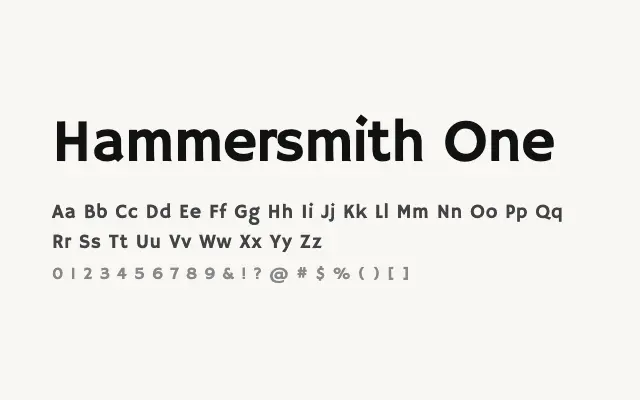
A confident, wide geometric sans built for headlines and display settings where bold clarity is required.
About
Hammersmith One's broad proportions and even stroke weight give it a commanding presence on screen and in print. It works well for headlines, logotypes, and short bursts of display copy where legibility at a glance matters. Its single Regular weight keeps things focused, making it best paired with a contrasting body typeface.
Classification
Hammersmith One features sturdy, wide letterforms with geometric underpinning and consistent stroke weight. Its single-weight design is optimised for headline and display use at larger sizes.
Weights
Regular
Languages
LatinLatin Extended
Tags
headlinedisplaygeometricsans-serifbrandingboldwidefreeopen-source