IM Fell DW Pica
Google Fonts · Igino Marini · 2007
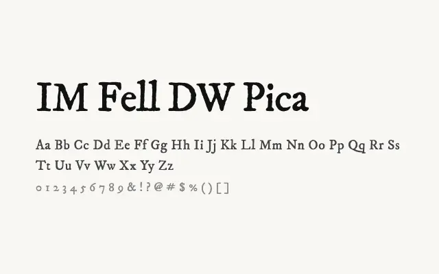
A characterful digital revival of the 17th-century Fell types, preserving their irregular, letterpress-era texture with deliberate authenticity.
About
IM Fell DW Pica reproduces the idiosyncratic charm of the original Oxford Fell types, with slight irregularities in stroke weight and spacing that evoke hand-set metal type. It is best used at display or large text sizes where its personality reads clearly, in contexts such as editorial headings, book covers, or literary branding with a historical feel. The single Regular weight limits its versatility but reinforces its role as a speciality display and editorial face.
Classification
A faithful digital revival of typefaces from the collection of Dr John Fell, donated to Oxford University Press in the late 17th century, characterised by irregular ink-trap details, slightly uneven stroke widths, and an authentic letterpress texture. The face has a notably rough, organic quality that distinguishes it sharply from polished modern digitisations.