IM Fell English
Google Fonts · Igino Marini · 2007
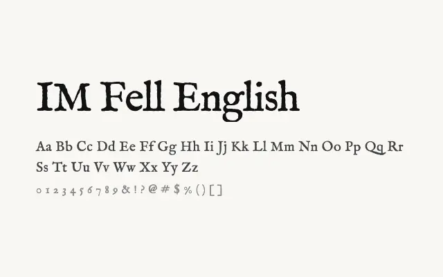
A deliberately rough and characterful revival of 17th-century metal type, full of historical imperfection.
About
IM Fell English draws from the historic Fell type collection donated to Oxford University, preserving the irregularities and wear of early printing. Its rough texture and uneven strokes make it ideal for period-appropriate editorial design, book covers, and projects demanding authentic historical atmosphere. It works best at display sizes where its idiosyncrasies can be appreciated rather than mistaken for error.
Classification
A digital revival of a worn, historical typeface from the Fell collection at Oxford's Bodleian Library, featuring irregular strokes and an authentically aged character. The letterforms exhibit the rough, hand-pressed quality of 17th-century metal type.