IM Fell Great Primer SC
Google Fonts · Igino Marini · 2007
serifold style serif small caps
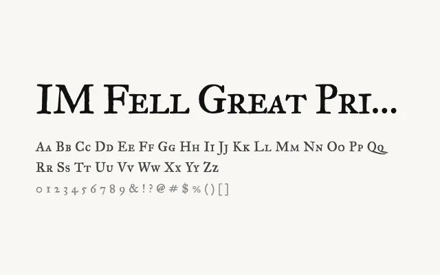
The small caps companion to IM Fell Great Primer, historically rich and typographically versatile.
About
IM Fell Great Primer SC provides true small caps to complement the Great Primer cut, enabling classical typographic hierarchies within the Fell family. Its proportions are suited to running heads, subheadings, and decorative text elements in editorial or book design. The inherent roughness of the letterforms adds warmth and authenticity that polished modern typefaces rarely achieve.
Classification
The small caps variant of IM Fell Great Primer, featuring true small capitals in the sturdy Great Primer proportions with the same aged, historically textured quality. Consistent with the design language of the entire Fell family.
Weights
Regular
Languages
Latin
Tags
serifeditorialdisplayvintagerevivalhigh-contrastexpressiveheadlinefreeopen-source