Inter
Google Fonts · Rasmus Andersson · 2017
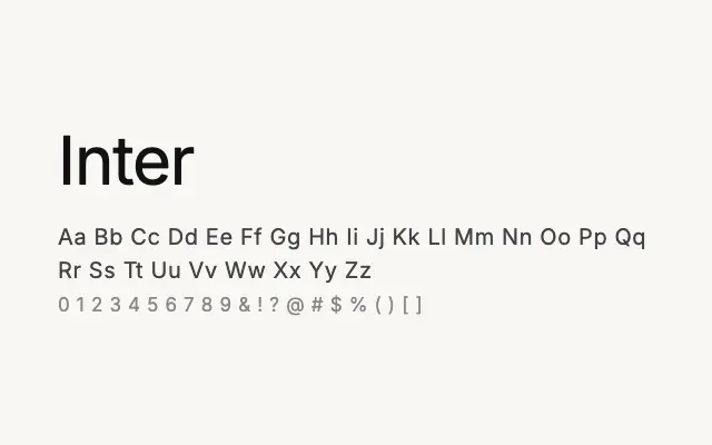
The definitive screen-optimised grotesque sans, built for UI work and now ubiquitous across digital products.
About
Inter was conceived from the ground up for computer screens, with a tall x-height and open letterforms that maintain clarity at small sizes and across low-resolution displays. Its neutral, clean character makes it equally at home in interface design, dashboards, and body copy. Extensive multilingual support including Cyrillic and Greek, combined with variable font technology, has made it a go-to workhorse for global digital products.
Classification
Inter is a highly refined neo-grotesque designed specifically for screen readability, with a tall x-height, open apertures, and carefully tuned metrics across a comprehensive weight range. It has become one of the most widely adopted UI typefaces of its era.