sans-serifrounded sans
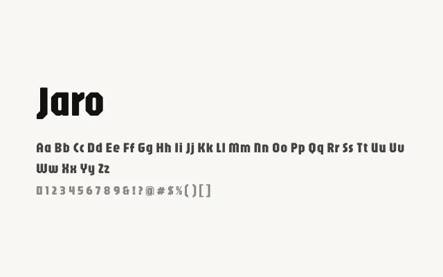
A rounded, compact sans-serif with a warm geometric personality that works well at display sizes.
About
Jaro's uniform stroke weight and softly rounded terminals give it an immediately approachable feel that sits comfortably in branding, app interfaces, and headline contexts. Its extended Latin and Vietnamese support broadens its utility across multilingual projects. The single weight limits its typographic range, but within that constraint it performs with consistency and charm.
Classification
Jaro features soft, rounded terminals and a compact, nearly monolinear construction with a tall x-height. Its single weight carries a friendly, approachable character suited to display sizes.
Weights
Regular
Languages
LatinLatin ExtendedVietnamese
Tags
displayroundedgeometricfriendlyplayfulheadlinebrandingsans-seriffreeopen-source