Jersey 20
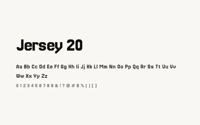
A 20-pixel grid font that offers the most readable entry in the standard Jersey series without sacrificing its retro bitmap identity.
About
Jersey 20's finer grid resolution allows for more convincing letter shapes, with diagonal strokes and rounded characters appearing more refined than in the 10 or 15 variants. This makes it the most practically useful of the standard Jersey fonts, suitable for game UI text, retro-themed subheadings, and digital signage where the pixel aesthetic is intentional. It still belongs unambiguously to the display category and should not be set small.
Classification
Jersey 20 uses a 20-unit pixel grid, providing noticeably more letterform detail and smoother apparent curves than the coarser Jersey variants. It begins to approach the legibility threshold where pixel fonts can function in subheading contexts.