Josefin Sans
Google Fonts · Santiago Orozco · 2010
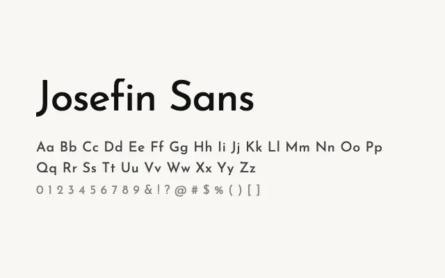
A refined geometric sans with strong Art Deco roots and elegant proportions that work particularly well at large sizes.
About
Josefin Sans channels the geometric type design of the early twentieth century, delivering clean, symmetrical letterforms with a decidedly vintage sensibility. Its tall x-height and uniform stroke weight make it a natural choice for fashion branding, editorial headlines, and luxury packaging. The wide weight range and variable font support give designers considerable flexibility.
Classification
Josefin Sans draws on 1920s–30s geometric sans traditions, with even stroke widths, near-perfect circular forms, and distinctively tall, elegant proportions. The thin weights in particular have a strong Art Deco flavour.