Josefin Slab
Google Fonts · Santiago Orozco · 2011
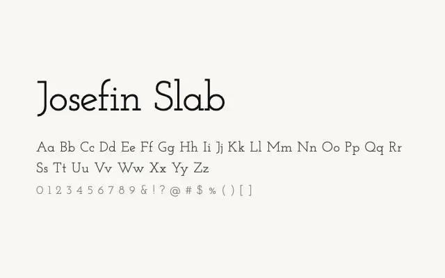
The slab serif companion to Josefin Sans, sharing its geometric Art Deco skeleton with the addition of uniform slab serifs.
About
Josefin Slab applies a consistent slab serif treatment to the same underlying geometric structure as Josefin Sans, making the two typefaces highly compatible for mixed-face typographic work. Its retro character suits editorial projects, poster design, and branding that needs a period flavour without feeling pastiche. Text sizes are serviceable but the design is most at home in display contexts.
Classification
Josefin Slab pairs the same geometric, Art Deco-influenced skeleton as its sans companion with sturdy slab serifs of uniform thickness. The result is a characterful display slab with a strongly retro personality.