Julius Sans One
sans-serifgeometric sans
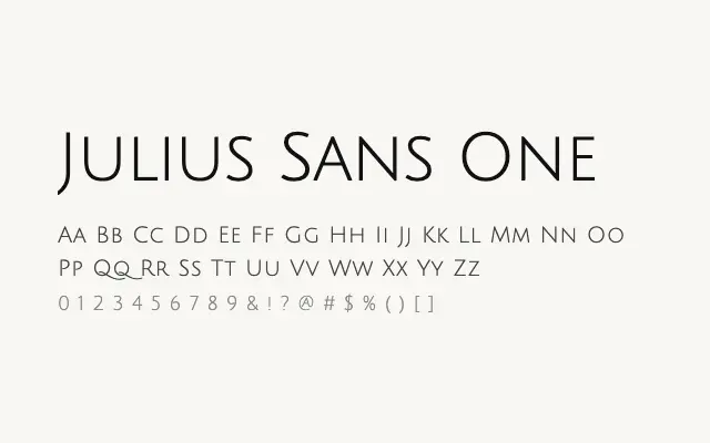
An elegantly spaced geometric sans conceived almost entirely for all-caps titling, with a refined Art Deco character.
About
Julius Sans One is built around wide tracking and thin, uniform strokes that give it a luxurious, high-fashion sensibility reminiscent of 1920s titling. It is nearly unusable at text sizes or in mixed case, but in all-caps headline settings it delivers instant elegance for fashion, beauty, and premium branding work. Its single-weight limitation is part of its focused, purposeful design philosophy.
Classification
Julius Sans One is a spaced, all-caps-optimised geometric sans with elegantly thin strokes and a strong Art Deco sensibility. It is designed almost exclusively for headline and titling use with generous letter spacing.
Weights
Regular
Languages
LatinLatin Extended
Tags
geometricdisplayheadlinefashionbrandingeditorialretrowidefreeopen-source