serifhumanist serif
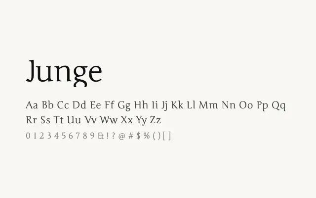
A quietly elegant humanist serif with classical proportions and a restrained, literary character.
About
Junge carries the measured refinement of traditional book typefaces without feeling archaic, making it well suited to long-form editorial and literary publishing. Its single Regular weight limits versatility, but within that constraint it performs reliably for body text and subheadings. It suits contexts where understated sophistication is preferred over typographic variety.
Classification
Junge is a refined, low-contrast serif with a classical humanist structure and clean, open letterforms. Its elegant proportions give it a literary quality suited to formal editorial use.
Weights
Regular
Languages
Latin
Tags
serifeditorialbodytexthigh-contrastcleanheadlinefreeopen-source