Kaisei HarunoUmi
serifmincho serif
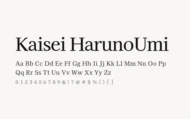
A composed Japanese Mincho serif that balances traditional CJK aesthetics with reliable Latin and Cyrillic support.
About
Kaisei HarunoUmi draws on classical Mincho proportions, offering restrained stroke contrast and sturdy serifs that hold up well at smaller sizes. Its multilingual range makes it a practical choice for Japanese publishing, academic documents, and editorial work that spans multiple scripts. The name evokes the spring sea — unhurried and expansive — which reflects its measured, readable character.
Classification
A Japanese Mincho-style serif designed for calm, readable body text across CJK and Latin scripts. Features moderate contrast and traditional stroke endings suited to long-form reading.
Weights
RegularMediumBold
Languages
CyrillicJapaneseLatinLatin Extended
Tags
seriftextbodyeditorialmultilingualhigh-contrastworkhorsefreeopen-source