Kaisei Opti
serifmincho serif
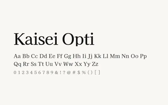
A refined Mincho serif optimised for optical clarity, offering an elegant reading experience across Japanese, Cyrillic, and Latin text.
About
Kaisei Opti takes the Mincho tradition and applies optical sizing principles, resulting in a typeface that feels more open and airy than closely related cuts. It suits editorial layouts, digital publishing, and any context where Japanese and Latin text must coexist gracefully. The lighter overall texture distinguishes it within the Kaisei family for use at smaller display or comfortable body sizes.
Classification
An optically adjusted Mincho serif with slightly more open spacing and refined stroke endings compared to its Kaisei siblings, lending it a lighter, more refined texture on screen.
Weights
RegularMediumBold
Languages
CyrillicJapaneseLatinLatin Extended
Tags
seriftextbodyeditorialmultilingualhigh-contrastscreenfreeopen-source