serifslab serif
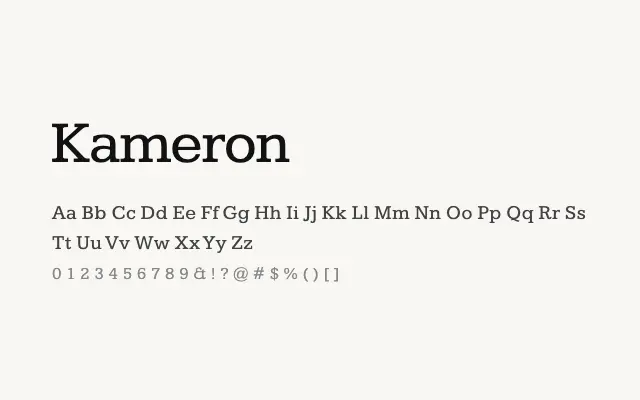
A dependable slab serif with squared serifs and solid construction that delivers authority at headline sizes and in branding contexts.
About
Kameron takes its cues from nineteenth-century slab serif traditions, presenting unbracketed serifs and low stroke contrast that give it a no-nonsense, industrial confidence. It works particularly well for editorial headlines, packaging typography, and logotype work where a typeface needs to command attention without resorting to decorative excess. The weight range from Regular to Bold provides enough variation for simple typographic hierarchies.
Classification
A sturdy, low-contrast slab serif with squared, unbracketed serifs and a robust construction that prioritises legibility and strong texture across weights.
Weights
RegularMediumSemiBoldBold
Languages
LatinLatin Extended
Tags
slabserifheadlinebrandingboldsignageworkhorseindustrialfreeopen-source