Karla
Google Fonts · Jonathan Pinhorn · 2012
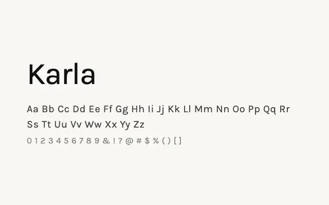
A dependable humanist sans with warm, open letterforms that works reliably as a body text and UI typeface.
About
Karla sits comfortably in the workhorse category — it is not flashy, but it is consistently legible and pleasant to read on screen across its full weight range. Its slight condensing gives it good economy in layouts without sacrificing readability, making it well-suited to app interfaces, dashboards, and long-form editorial on web. The extensive weight options allow for clear typographic hierarchy in both display and text roles.
Classification
Karla is a clean, slightly condensed humanist sans-serif with friendly, open letterforms and a subtle warmth that distinguishes it from colder grotesques. It was designed for screen legibility and performs well across a wide range of sizes.