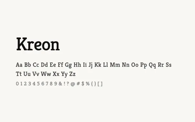
A sturdy humanist slab serif with warm proportions and excellent text performance across print and screen.
About
Kreon occupies a distinctive niche by combining the visual solidity of slab serifs with the open, readable forms of humanist design, resulting in a typeface that feels approachable without sacrificing authority. Its five-weight range makes it genuinely versatile, covering body text, subheadings, and headlines within a single family. It works particularly well in editorial, educational, and long-form digital content where sustained readability is essential.
Classification
A humanist slab serif with low contrast, sturdy slab serifs, and open, legible letterforms designed to perform across both print and screen. The design blends slab structure with the warmth of humanist sans proportions.