Krona One
sans-serifgeometric sans
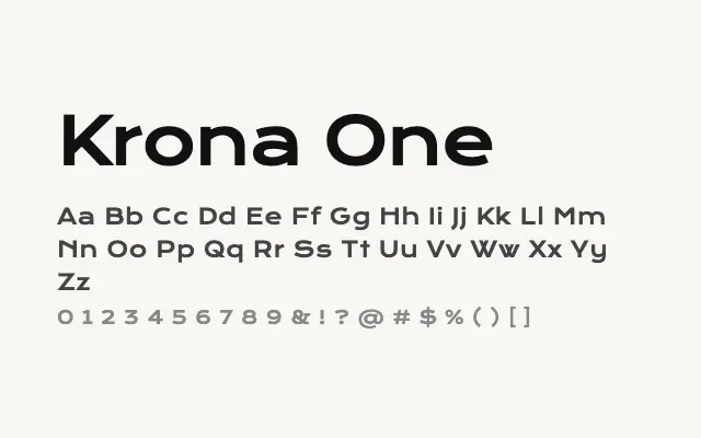
A wide, heavy geometric sans built for maximum impact at large sizes.
About
Krona One's expanded proportions and uniform stroke weight make it immediately commanding in headline and poster contexts. Its single Regular weight belies its visual strength — it reads as bold by virtue of its sheer width and solidity. Best deployed sparingly for titles, logotypes, and short-form display copy.
Classification
Krona One features wide, near-monoline letterforms with strong geometric underpinning and a distinctly expanded horizontal proportion. Its single weight is bold and imposing, designed primarily for headline use.
Weights
Regular
Languages
LatinLatin Extended
Tags
displayheadlinegeometricboldwidebrandingposterfreeopen-source