Kulim Park
sans-serifhumanist sansitalic
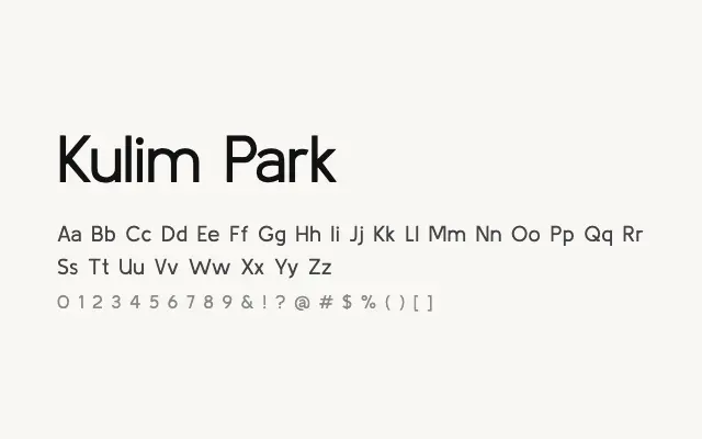
A refined humanist sans with calligraphic undertones that set it apart from generic grotesques.
About
Kulim Park draws on calligraphic tradition to introduce subtle stroke modulation and diagonal stress into what is otherwise a clean sans-serif structure. This gives it a quiet elegance well-suited to editorial design, cultural institutions, and premium branding. Its limited weight range keeps it focused rather than broadly utilitarian.
Classification
Kulim Park has a distinctive calligraphic influence visible in its letterform construction, with subtle inktraps and pen-derived angles giving it warmth unusual in sans-serifs. It skews towards editorial and refined branding applications.
Weights
ExtraLightLightRegularSemiBoldBold
Languages
LatinLatin Extended
Tags
editorialbrandinghumanistcalligraphicheadlinedisplaycleanfreeopen-source