Lato
Google Fonts · Łukasz Dziedzic · 2010
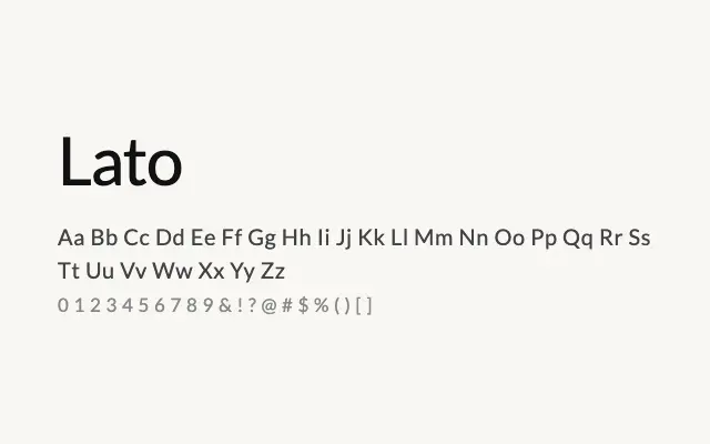
One of the most widely used humanist sans-serifs on the web, offering warmth and neutrality in equal measure.
About
Lato was designed with a dual character: the overall impression is geometric and clean, yet its letterforms carry subtle calligraphic traces that give it a human warmth few neutral sans-serifs achieve. Its extensive weight range makes it highly practical for complex typographic systems spanning body copy, UI, and headlines. Immensely popular in web design, it remains one of the most reliably readable and versatile typefaces available for screen.
Classification
A humanist sans-serif with subtle classical proportions, slight optical corrections borrowed from calligraphic tradition, and a warm yet clean character. Designed to balance the neutrality of a grotesque with the readability of a humanist.