Lexend
Google Fonts · 2018
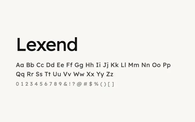
A research-driven humanist sans engineered to improve reading speed and reduce cognitive load on screen.
About
Lexend was developed by Thomas Jockin in collaboration with readability researchers, with letter spacing and form tuned to assist readers with dyslexia and reduce overall visual stress. Its open, humanist letterforms perform reliably across UI, body copy, and editorial contexts at all sizes. The full weight range from Thin to Black and broad Latin support make it a genuinely versatile workhorse for digital products.
Classification
Designed specifically to reduce visual noise and improve reading fluency, with carefully calibrated letter spacing and humanist proportions. Research-backed design choices distinguish it from standard UI sans-serifs.