Lexend Deca
Google Fonts · Thomas Jockin · 2019
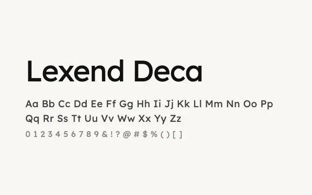
A readability-focused humanist sans designed to reduce visual stress and support fluent reading.
About
Lexend Deca is the baseline width in the Lexend superfamily, developed from research into reading proficiency and visual crowding. Its open letterforms, generous spacing, and neutral character make it well suited to body text, educational materials, and accessible UI design. The full nine-weight range extends its usefulness from running text to interface hierarchies.
Classification
Lexend Deca is the standard-width member of the Lexend family, designed with carefully adjusted letter spacing and open apertures to reduce visual stress and improve reading fluency. Its moderate proportions and clean stroke terminals make it highly legible at text sizes.