Lexend Giga
Google Fonts · Thomas Jockin · 2019
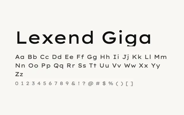
A generously wide humanist sans that doubles as a striking display face at larger sizes.
About
Lexend Giga's extended proportions were originally conceived for maximum letter-spacing accessibility, but the width lends the typeface an assertive presence when set large. It works well as a headline face for editorial or branding projects that want a clean, contemporary feel without resorting to condensed styles. Nine weights mean it can shift from bold display use to lighter, more refined applications.
Classification
Lexend Giga pushes the width further still, producing notably expanded letterforms while preserving the family's consistent open-aperture humanist design philosophy. At display sizes it takes on an imposing, spacious quality.