Lexend Peta
Google Fonts · Thomas Jockin · 2019
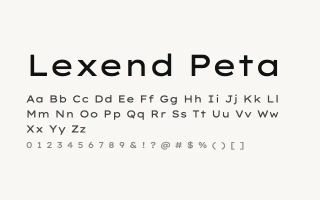
One of the widest entries in the Lexend family, pushing into genuinely expansive display territory while retaining humanist clarity.
About
Lexend Peta's extreme width places it firmly in display rather than text usage for most applications, making it a natural choice for posters, large-format headlines, and brand lockups that demand horizontal dominance. Its clean, undecorated construction keeps it from feeling novelty-driven despite the unusual proportions. All nine weights are available, allowing transitions from hair-thin to ultra-bold.
Classification
Lexend Peta reaches near the widest end of the Lexend spectrum, with letterforms substantially broader than conventional text faces. The design remains restrained and geometric in feel despite the extreme proportions.