Lexend Zetta
Google Fonts · Thomas Jockin · 2019
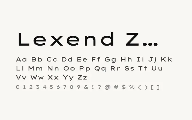
The widest typeface in the Lexend family, an extreme humanist sans built for maximum letter-spacing and commanding display use.
About
Lexend Zetta represents the logical endpoint of the family's width progression, with letterforms so broad they become a strong design statement in their own right. Originally conceived as the maximum-spacing option for readers with the greatest sensitivity to letter crowding, it finds a natural second life as an eye-catching display face for posters, covers, and brand moments. Its clean, neutral construction prevents the extreme width from tipping into novelty.
Classification
Lexend Zetta is the widest member of the Lexend superfamily, representing the outermost point of the width-based readability system devised by Thomas Jockin. At this extreme, the letters are strikingly extended and best reserved for display applications.