Lusitana
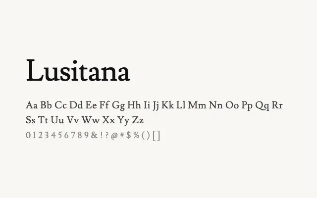
A sturdy, readable transitional serif with Iberian character that performs reliably in editorial and body text settings.
About
Lusitana draws on the rich tradition of Portuguese and Iberian typography, combining moderate contrast and confident serifs with a warm, grounded personality. Its two weights make it practical for book design, long-form web editorial, and branding projects seeking a serif with cultural distinctiveness. It reads well at modest text sizes and holds its own in both print and screen contexts.
Classification
A Portuguese-inspired serif with moderate stroke contrast and sturdy slab-influenced serifs that blend transitional structure with a robust, legible character. The design references Iberian typographic heritage with an accessible contemporary finish.