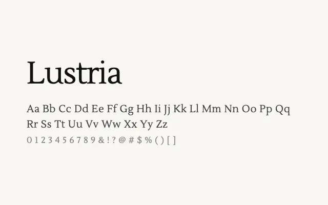
A clean, contemporary transitional serif that brings understated elegance to editorial and body text use.
About
Lustria offers well-balanced proportions and moderate contrast that make it at home in magazine layouts, long-form web articles, and corporate editorial design. Its single weight is a limitation for complex typographic hierarchies, but its refined letterforms hold up well in both display and text applications. It is a reliable, if unspectacular, choice for projects needing a polished serif without strong stylistic idiosyncrasies.
Classification
A clean, contemporary transitional serif with moderate stroke contrast, sharp bracketed serifs, and a restrained elegance suited to extended reading. Its proportions are classical without being archaic, giving it broad editorial applicability.