M PLUS 1
Google Fonts · Coji Morishita · 2021
sans-serifgeometric sans
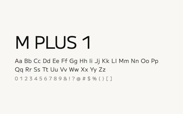
A versatile, neutrally styled geometric sans that handles Japanese and Latin scripts with equal poise across a broad weight range.
About
M PLUS 1 is a workhorse multilingual sans designed for digital interfaces and editorial use where Japanese and Latin text must coexist harmoniously. Its nine weights and variable font capability make it highly adaptable to typographic systems. The uniform stroke treatment and generous x-height ensure strong legibility from caption sizes up to large display settings.
Classification
A clean, mechanically constructed Japanese-Latin sans-serif with near-uniform stroke width and open apertures. The design balances CJK legibility requirements with a modern, neutral Latin aesthetic.
Weights
ThinExtraLightLightRegularMediumSemiBoldBoldExtraBoldBlack
Languages
JapaneseLatinLatin ExtendedVietnamese
Tags
sans-serifgeometricscreenuibodymultilingualvariablecleanfreeopen-source