M PLUS 2
Google Fonts · Coji Morishita · 2021
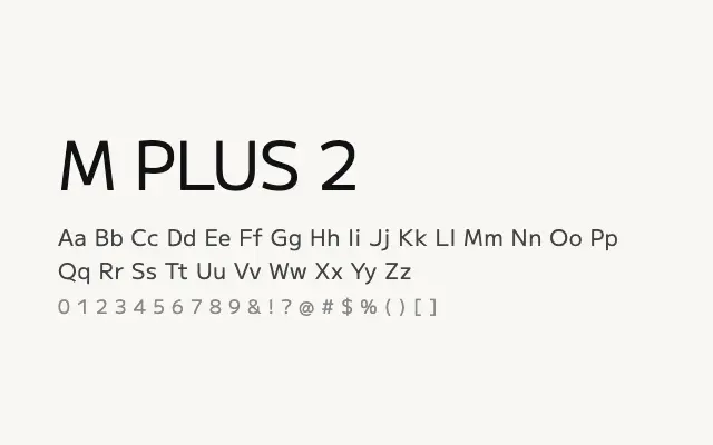
A humanist-leaning revision of the M PLUS 1 design that trades strict geometry for improved text-setting warmth and readability.
About
M PLUS 2 refines the M PLUS 1 skeleton with slightly more humanist letterform decisions, making it marginally more comfortable for extended reading in both Japanese and Latin. It covers the same broad weight range and is available as a variable font, offering smooth interpolation across its axis. It suits editorial platforms, apps, and any context where a softened, approachable sans is preferred over a strictly mechanical one.
Classification
A refined successor to M PLUS 1, with subtle humanist adjustments that soften the geometric rigidity of the original. Stroke terminals and spacing reflect greater optical sensitivity, improving readability in running text.