M PLUS U
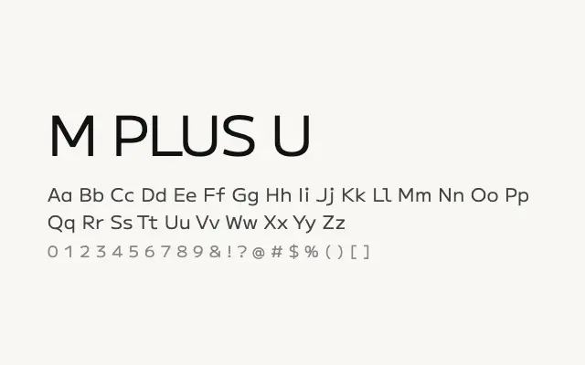
A versatile geometric sans-serif covering Japanese and Latin scripts across an extensive weight range.
About
M PLUS U combines clean geometric construction with broad multilingual support, making it a practical choice for interfaces and digital products requiring both Japanese and Latin text. Its uniform stroke weight and open forms maintain clarity at small sizes on screen. The wide weight range from Thin to Black gives designers considerable flexibility across headline and body settings.
Classification
M PLUS U is a clean, low-contrast geometric sans designed for Japanese and Latin scripts, with uniform stroke weights and open apertures that aid screen legibility. It covers a broad range of weights from Thin to Black, making it highly versatile across UI and editorial contexts.