Manrope
Google Fonts · Mikhail Sharanda · 2018
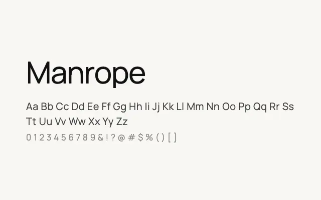
A refined geometric sans with humanist warmth, built for digital interfaces and extended reading.
About
Manrope sits comfortably between the precision of geometric sans-serifs and the approachability of humanist designs, making it versatile across UI, branding, and editorial contexts. Its generous x-height and open apertures maintain clarity at small sizes, while the range of weights from ExtraLight to ExtraBold gives designers strong typographic hierarchy. Cyrillic and Greek support extends its usefulness across multilingual projects.
Classification
Manrope blends geometric and humanist traits, with clean open letterforms and consistent stroke width. Its optical adjustments across eight weights make it particularly legible at small sizes on screen.