Metrophobic
sans-serifhumanist sans
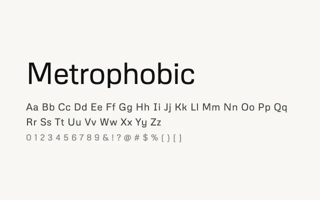
A clean, screen-focused humanist sans with modest proportions and solid legibility credentials.
About
Metrophobic's neutral, open letterforms make it a competent choice for interface design and on-screen body text where readability is the priority. It lacks the design distinction of more celebrated humanist sans-serifs, but performs reliably at smaller sizes. Its single weight is a significant practical limitation for most design systems.
Classification
Metrophobic is a clean, neutral sans-serif with humanist proportions and a slightly informal feel, designed with legibility on screen as a primary concern. Its modest character makes it functional for UI and body text but somewhat unremarkable as a design statement.
Weights
Regular
Languages
LatinLatin ExtendedVietnamese
Tags
sans-serifhumanistcleanscreenuitextneutralfriendlyfreeopen-source