Mochiy Pop P One
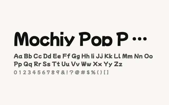
The proportional-kana sibling of Mochiy Pop One, sharing the same bold rounded character with adjusted kana spacing.
About
Mochiy Pop P One differs from Mochiy Pop One in its use of proportional kana spacing, which can produce a slightly more natural text rhythm in certain Japanese typesetting scenarios. Both fonts share the same chunky, pop-inflected display personality and are best used for headlines, packaging, and large-format digital content. The choice between the two will depend on specific Japanese typesetting requirements rather than aesthetic preference.
Classification
Mochiy Pop P One is a proportional-kana variant of Mochiy Pop One, sharing the same rounded, display-oriented design but with proportional spacing for the kana characters. The distinction between the two is subtle and primarily relevant for specific Japanese typesetting contexts.