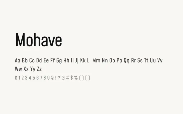
A wide, no-nonsense industrial sans with clean geometry and a tough, functional personality suited to headlines and branding.
About
Mohave draws on the visual language of engineering lettering and mid-century signage, making it a natural fit for automotive, construction, and technology branding. Its five-weight range from Light to Bold gives designers reasonable flexibility across both display and mid-sized text settings. The typeface performs particularly well in all-caps headlines where its wide, even proportions read with real authority.
Classification
Mohave is a wide, sturdy sans-serif with slightly condensed proportions, sharp terminals, and a utilitarian, industrial character reminiscent of technical lettering and signage. Its modest contrast and clean geometry give it a functional toughness.