serifold-style serif
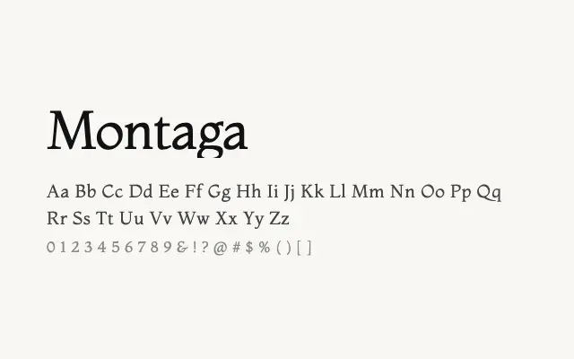
A restrained, classically proportioned serif that carries quiet sophistication without demanding attention.
About
Montaga draws on old-style traditions with its angled stress, moderate stroke contrast, and humanist proportions that feel comfortable in both print and screen editorial contexts. Its single Regular weight limits versatility, making it most suitable for display headings, pull quotes, or accent text in designed layouts. The overall impression is understated and literary, well suited to book covers, journals, and cultural publications.
Classification
A delicate, classical serif with moderate contrast and humanist proportions reminiscent of Renaissance typefaces. Its fine strokes and traditional construction give it a refined, bookish quality.
Weights
Regular
Languages
Latin
Tags
serifeditorialbodytexthigh-contrastrevivalbrandingfreeopen-source