Montserrat
Google Fonts · Julieta Ulanovsky · 2011
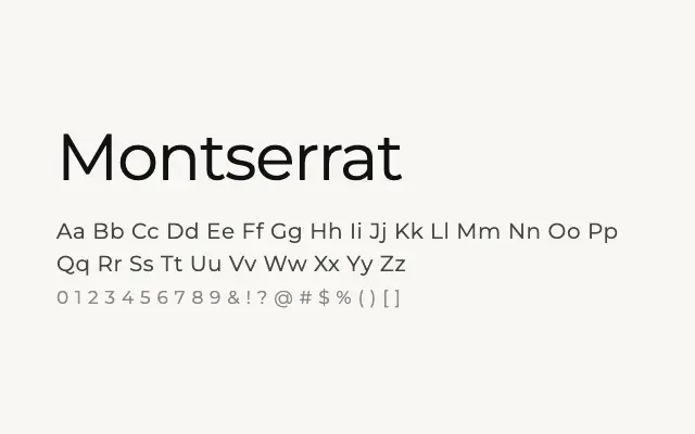
One of the most widely used geometric sans-serifs on the web, combining modernist construction with warmth drawn from early twentieth-century urban lettering.
About
Montserrat draws from the hand-painted signs of the Buenos Aires neighbourhood of the same name, giving its geometric foundations a subtle humanist warmth that distinguishes it from colder counterparts such as Futura. Its nine weights from Thin to Black, combined with Cyrillic and Latin Extended coverage, make it one of the most practically versatile typefaces in the Google Fonts catalogue. It performs strongly in branding, UI, editorial headlines, and marketing contexts across both digital and print.
Classification
A geometric sans-serif inspired by the signage and urban lettering of the Montserrat neighbourhood of Buenos Aires, with near-perfect circular forms and clean, modernist construction. Its extensive weight range and Cyrillic coverage make it exceptionally versatile.