Mulish
Google Fonts · Vernon Adams · 2011
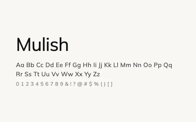
A refined, minimalist geometric sans that sits comfortably between cold geometry and humanist warmth.
About
Mulish draws on geometric sans traditions while softening its forms enough to remain friendly and readable at small sizes, making it popular for product interfaces and digital editorial work. Its near-neutral character means it rarely dominates a layout, functioning well as a reliable supporting typeface for branding and UI systems. The broad weight range, including a Black weight, gives designers room to create clear typographic hierarchy.
Classification
Mulish is a minimalist geometric sans with low contrast and clean, near-circular letterforms influenced by the classic grotesque tradition. It strikes a balance between geometric purity and approachable warmth, making it versatile across UI and editorial contexts.