Nanum Gothic
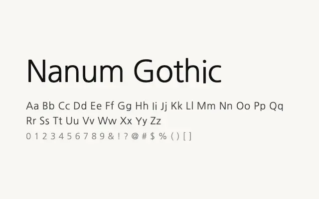
One of the most popular Korean web fonts, Nanum Gothic delivers clean, neutral sans-serif letterforms optimised for on-screen reading of Hangul and Latin alike.
About
Nanum Gothic was developed by Sandoll Communications for Naver and has become a default choice for Korean digital publishing due to its excellent screen performance and neutral personality. Three weights — Regular, Bold, and ExtraBold — provide enough range for most UI and editorial hierarchies. Its broad adoption makes it a reliable, safe choice for any Korean-language web or app project.
Classification
Nanum Gothic is a clean, screen-optimised sans-serif designed for comfortable reading of Korean Hangul alongside Latin text, with multiple weights supporting typographic hierarchy. It is one of the most widely used Korean web fonts owing to its neutral, legible character.