Nanum Myeongjo
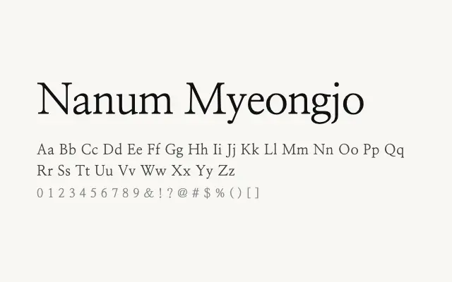
A refined Korean serif in the Myeongjo tradition, offering strong stroke contrast and elegant letterforms suited to editorial and long-form digital reading.
About
Nanum Myeongjo brings the formal authority of traditional Korean book typography to the screen, with three weights that serve everything from body text to headline use. Its high stroke contrast and precise terminal details give it a classical, literary feel appropriate for news, publishing, and cultural platforms. Like its Nanum Gothic sibling, it benefits from widespread adoption and thorough Korean glyph coverage.
Classification
Nanum Myeongjo adapts the classical Myeongjo (Mincho) serif tradition — characterised by horizontal strokes with triangular terminals and strong stroke contrast — for screen use across Korean and Latin scripts. It carries a formal, literary quality well-suited to long-form reading.