Nobile
Google Fonts · Vernon Adams · 2011
sans-serifhumanist sansitalic
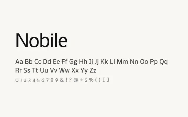
A solid, screen-optimised humanist sans with broad Cyrillic support and reliable legibility across weights.
About
Nobile was designed with digital clarity in mind, making it a dependable choice for interfaces, editorial body copy, and multilingual web projects. Its even spacing and moderate proportions hold up well at smaller sizes, while the bold weight carries enough weight for headlines. The Cyrillic extension broadens its practical appeal considerably.
Classification
Nobile features slightly humanist proportions with a sturdy, upright construction suited to screen use. Its clean strokes and modest contrast give it a dependable, readable quality across weights.
Weights
RegularMediumBold
Languages
CyrillicLatinLatin Extended
Tags
sans-serifhumanistscreenuibodytextworkhorsemultilingualfreeopen-source