Noto Serif Display
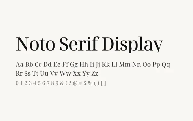
Noto Serif Display elevates the Noto serif system into headline territory with sharper contrast and more refined detailing for Cyrillic and Greek.
About
Where the standard Noto Serif is engineered for sustained reading, Noto Serif Display is optimised for impact at large sizes, making it appropriate for editorial headlines, poster work, and display applications in Cyrillic and Greek scripts. The increased stroke contrast gives it a more classical, high-quality feel that suits cultural, editorial, and publishing contexts. Its nine-weight range provides substantial flexibility for typographic hierarchies.
Classification
A dedicated display variant of the Noto Serif family with enhanced contrast and refined detailing suited to large sizes, covering Cyrillic, Cyrillic Extended, and Greek scripts. The higher stroke contrast and more pronounced serifs distinguish it clearly from the text-optimised Noto Serif siblings.