Noto Serif JP
Google Fonts · 2014
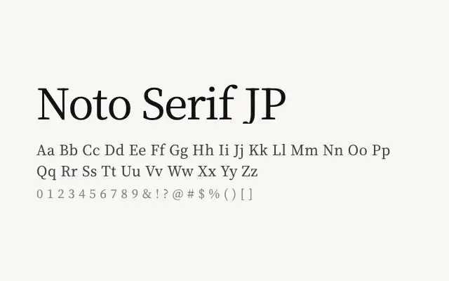
A comprehensive Japanese serif that unifies CJK and Latin characters within a single, harmonious type system.
About
Noto Serif JP is built for long-form Japanese text, offering eight weights that give designers flexibility across editorial, publishing, and digital contexts. Its design carefully balances traditional calligraphic stroke conventions with the demands of screen rendering. As part of the broader Noto family, it ensures visual consistency when mixing Japanese with Latin or Cyrillic text.
Classification
Designed to harmonise Japanese kanji, kana, and Latin characters within a unified serif framework, with stroke contrast and terminal details that respect traditional Japanese typographic conventions. Part of Google's Noto project aimed at eliminating tofu across all scripts.