Nova Slim
Google Fonts · Wojciech Kalinowski
displaygeometric display sanscondensed
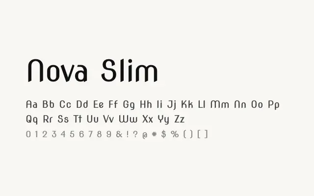
A slender geometric display sans with a cool, architectural economy of form.
About
Nova Slim's tight proportions and even stroke weight give it a modernist, structured appearance suited to headlines, signage, and editorial display contexts. Its narrow footprint makes it efficient for constrained layouts while retaining visual impact. Like its Nova siblings, it is limited to a single weight, restricting typographic flexibility.
Classification
Nova Slim is a narrow, upright geometric sans with a clean, architectural quality derived from its consistent stroke weight and condensed proportions. It is designed for display use at larger sizes.
Weights
Regular
Languages
LatinLatin Extended
Tags
displaygeometriccondensedheadlinedecorativecleanfreeopen-source