sans-serifgeometric sans
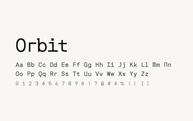
A stark, modular geometric sans bridging Korean and Latin scripts with a cool, technical character.
About
Orbit's simplified letterforms and near-uniform stroke weight give it a futuristic, constructed quality unusual among multilingual sans-serifs. Its Korean Hangul glyphs are designed to harmonise with the Latin in weight and spirit, making it a useful choice for Korean-English brand and interface work. The single weight restricts its flexibility but reinforces its distinctive, purposeful personality.
Classification
A minimalist geometric sans with strong Korean and Latin coverage, featuring simplified, almost modular letterforms. The design has a distinctly technical, space-age quality with very low stroke contrast.
Weights
Regular
Languages
KoreanLatinLatin Extended
Tags
sans-serifgeometricmodularheadlinedisplayscreenmultilingualtechnicalfreeopen-source