Ovo
Google Fonts · Nicole Fally · 2011
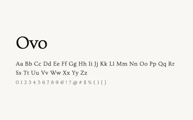
A quietly elegant transitional serif with refined proportions and understated sophistication.
About
Ovo brings a gentle classicism to editorial and literary typesetting, with letterforms that feel considered rather than showy. Its moderate contrast and open counters ensure reasonable legibility at text sizes on screen, though its single Regular weight limits its versatility in complex typographic systems. It suits upscale editorial, boutique branding, and literary contexts where restraint is a virtue.
Classification
Ovo is an elegant, low-contrast serif with classical proportions and refined, somewhat restrained details that place it between old-style and transitional categories. Its delicate stroke modulation and open letterforms give it a quiet sophistication.