Playfair Display
Google Fonts · Claus Eggers Sørensen · 2011
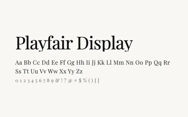
One of the most widely used editorial serifs on the web, Playfair Display delivers high-contrast elegance at headline sizes with considerable authority.
About
Playfair Display's sharply cut serifs and dramatic stroke contrast make it a go-to choice for magazine mastheads, luxury brand identities, and editorial headline hierarchies. Its Cyrillic support broadens its application for Slavic-language publishing. While not designed for continuous body text, it commands attention wherever it is set large.
Classification
Playfair Display is a high-contrast serif with sharp bracketed serifs and a strong vertical stress, modelled on the eighteenth-century transitional style of Baskerville and Caslon. It was conceived primarily for display and headline use.