Playfair Display SC
Google Fonts · Claus Eggers Sørensen · 2012
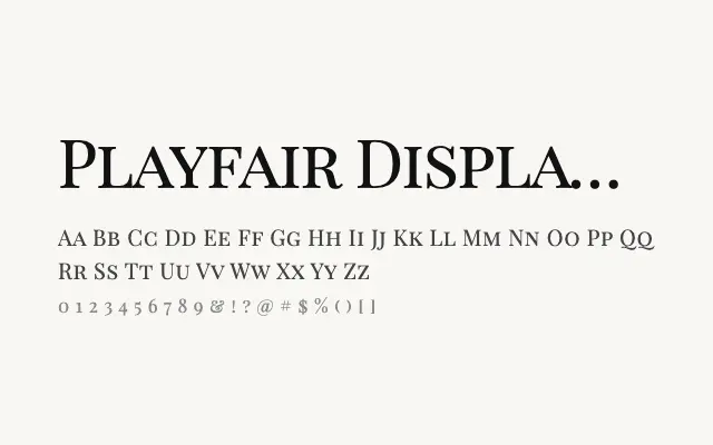
The small-caps companion to Playfair Display, offering true typographic small capitals for refined headline and display work.
About
Playfair Display SC provides properly proportioned small capitals that integrate seamlessly with the Playfair Display family, enabling classical typographic conventions such as all-small-cap titling and mixed-case elegance. Its three weights — Regular, Bold, and Black — cover the most common display needs without over-extending the family. Ideal for book covers, bylines, section headings, and any editorial context where small-cap refinement is valued.
Classification
Playfair Display SC is a small-capitals companion to Playfair Display, offering true-cut small caps for refined typographic settings. Its limited weight range focuses it firmly on display and headline applications.