Plus Jakarta Sans
Google Fonts · Tokotype · 2020
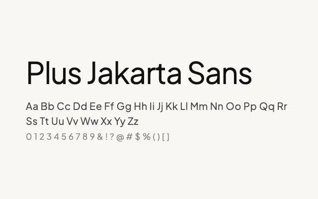
A polished geometric humanist sans that strikes a confident balance between warmth and professionalism, well-suited to digital interfaces and branding.
About
Plus Jakarta Sans has earned widespread adoption in UI design and tech branding thanks to its open, readable letterforms and the easy authority it projects across a full weight range. Its geometric skeleton is softened by humanist details — notably in the terminals and apertures — giving it approachability without sacrificing crispness on screen. The family handles everything from body copy to bold display headlines with reliable consistency.
Classification
Plus Jakarta Sans blends geometric structure with humanist warmth, producing a versatile sans-serif with open apertures, moderate contrast, and a friendly yet professional character. The family covers an extensive weight range with variable font support.