Poly
Google Fonts · Jonny Pinhorn · 2012
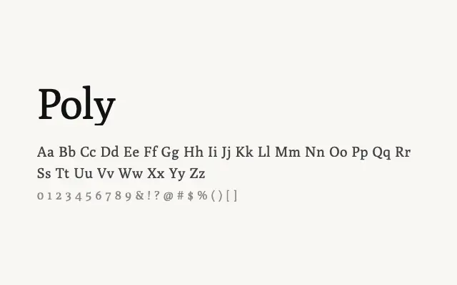
A restrained transitional serif designed expressly for on-screen readability at small text sizes.
About
Poly was built with digital reading environments in mind, with proportions and spacing tuned for clarity on low-resolution screens. Its transitional letterforms strike a balance between classical authority and modern practicality, making it a dependable choice for long-form web text. The single weight is a notable limitation, but its clean execution within that constraint is commendable.
Classification
Poly is a compact, highly readable text serif with transitional characteristics, designed specifically for comfortable on-screen reading at small sizes. Its moderate contrast and clean construction prioritise clarity over stylistic flourish.