serifdidone serif
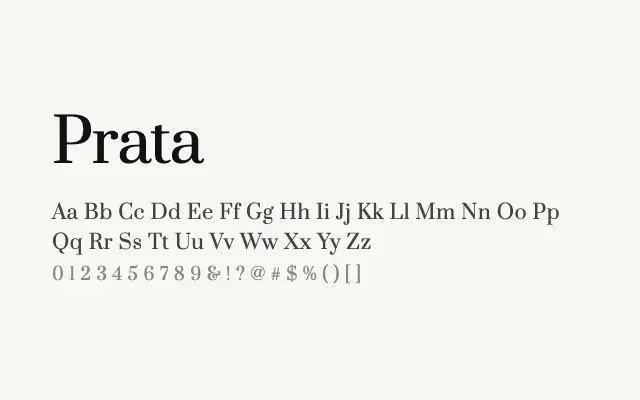
A high-contrast Didone serif with sharp elegance suited to editorial and luxury applications.
About
Prata draws on the classical Didone tradition, delivering strong stroke contrast and hairline serifs that command attention at display sizes. It performs particularly well in fashion editorial, luxury packaging, and high-end branding where refinement and authority are essential. Cyrillic support broadens its appeal for multilingual publishing projects.
Classification
Prata features high contrast between thick and thin strokes with sharp, refined serifs characteristic of the Didone tradition. Its upright, elegant structure gives it a distinctly editorial and fashion-forward quality.
Weights
Regular
Languages
CyrillicCyrillic ExtendedLatinVietnamese
Tags
serifhigh-contrasteditorialdisplayheadlinefashionbrandingfreeopen-source