Prociono
serifhumanist serif
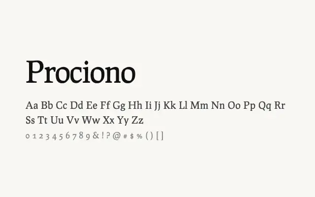
A restrained humanist serif with Renaissance roots, suited to scholarly and literary text setting.
About
Prociono draws on old-style humanist serif traditions to produce a typeface that feels considered and literate without being showy. Its moderate stroke contrast and open apertures make it comfortable for extended reading in books, essays, and editorial layouts. The single-weight limitation reduces its flexibility for complex typographic hierarchies, but as a text face it performs with quiet dignity.
Classification
Prociono is a quietly refined humanist serif with moderate contrast and open, readable letterforms influenced by the Renaissance tradition. Its single weight and understated personality give it an academic, bookish quality.
Weights
Regular
Languages
Latin
Tags
seriftextbodyeditorialhumanistcleanworkhorsefreeopen-source